
An integrated app allowing customers access to their electric company’s services at their fingertips.
WEC Energy Group is one of the United States’ largest electric and natural gas delivery companies, providing vital services to around 4.4 million customers across the Midwest.
The client was lacking a user-friendly platform for utility management and proper foundation technologies for large-scale utility programs, resulting in an unsatisfying customer experience in a market where consumers expect quality digital services.
My Role
Lead Experience Designer, UX Research, Workshop Facilitation, Prototyping.
The Team
Project Manager, Front End Developer, Technical Architect, Account Manager, Content Strategist.
Scope
iOS & Android apps with an MVP feature set.
“How might we expand WEC Energy Group’s product offerings into the mobile space?”

Guiding Principles
We’re your neighbor – friendly, knowledgeable and helpful.
We are capable, caring and confident in moments that are out of the customer’s control, like power outages. We are informed and helpful in moments where customers need guidance, like signing up for new services.
We must be persistent in maintaining focus on the customer at every evaluation and decision point for the mobile app asking:
Have we designed for the customer?
Is this simple to use?
Will this be useful?
Is this the best solution for the majority of our customers?
Provide customers with the experience they want and expect
Friendly - Trustworthy and reliable
Knowledgable - Understanding and human
Helpful - Secure and transparent
Account Overview

Contextual Cards
The account overview screen is the first screen users interact with when using the app. Contextual cards on this screen provide a targeted experience that quickly connects users to the services they need. Following our guiding principals, we designed the contextual cards to contain brief but informative content with a friendly and knowledgable tone.
Energy Usage
Data visualization
One of the main questions received by the call center is “Why is my bill so high?”. A user can interact with their data to understand trends in their energy usage. Peeking above the fold, we designed insight cards to summarize the data with easy to understand copy.
Billing & Payments

Billing Breakdown
Users were often confused by the breakdown of their energy bill resulting in frustration and distrust. By simply providing a clear labeling structure and easy to understand summary, users better understood the make-up of their total charges.
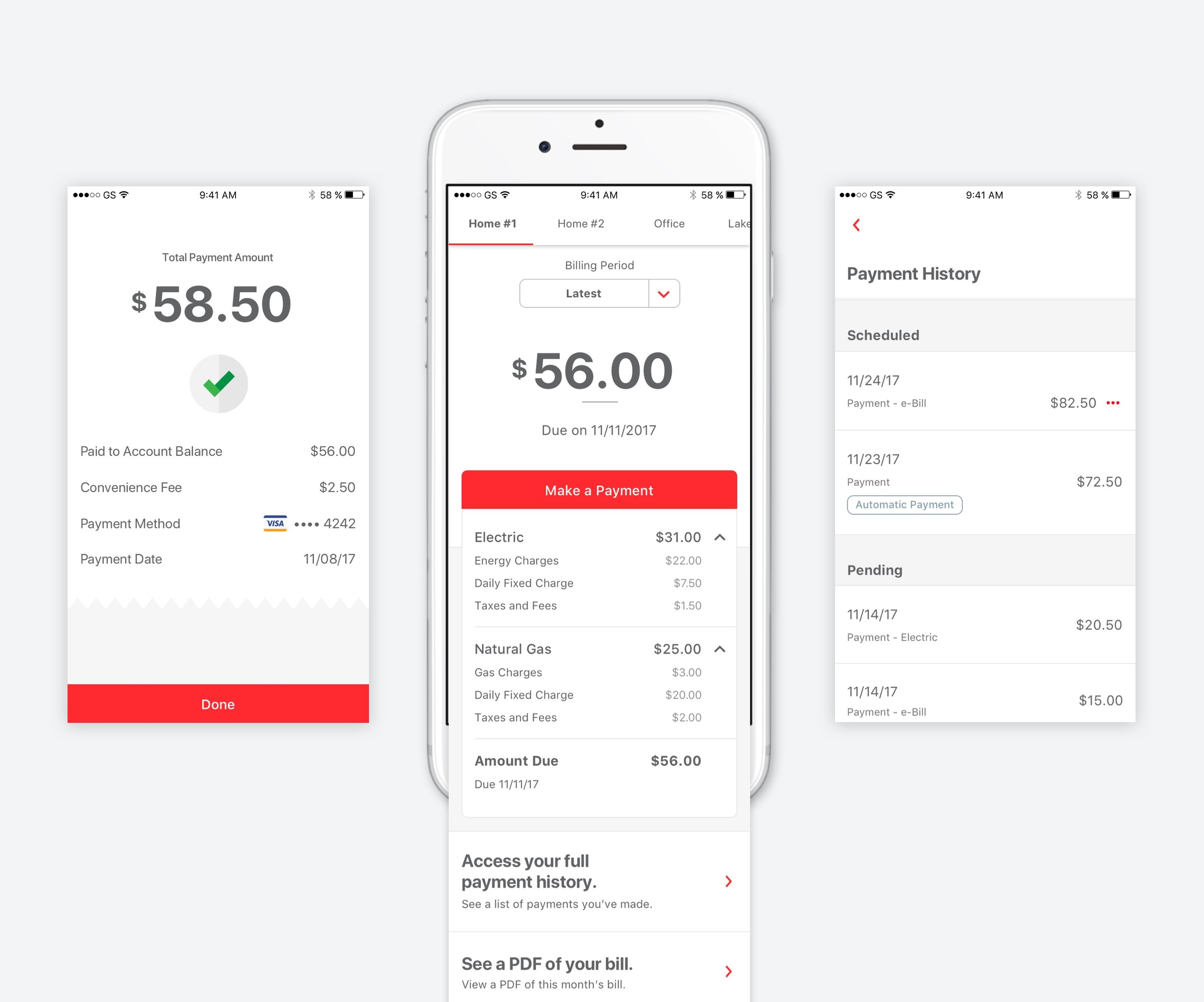
Outages

Reporting an Outage
There were many pain points in the original user journey of reporting an outage. One being the amount of unnecessary information the user was required to provide before officially reporting. By working closely with the client and technology team, we were able to re-design their reporting flow to only include to most important information so a user can report an outage in 2 easy steps.
Experiencing an outage in your home is an extremely inconvenient and sometimes dangerous moment. Similar to an ordering service like Uber Eats, we wanted to provide users with timely and meaningful updates through a series of notifications so they know what is happening behind the scenes every step of the way.

The Process
Modernizing legacy software
Where we began…

After prioritizing core MLP features with the client, I began the design process by creating a high-level app flow to gain consensus around navigation.
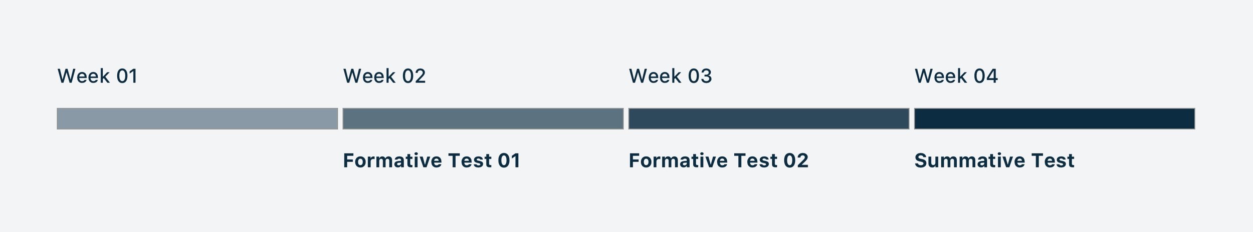
Continuous Formative & Summative Usability Testing
The solution was designed hand in hand with the client’s customers through extensive user testing with over 1000 participants, which translated the voice of their customers into a new digital experience.
This project was structured around four 4-week design sprints that included formative tests on weeks 2 and 3, ending the final week of the sprint with a summative test. The formative tests allowed for rapid iteration and continuous feedback on our wireframes, while the summative tests allowed for a more refined approach using tappable prototypes with applied look and feel.
After launching to beta users, the client has reduced service response time, allowing their employees to help customers faster, driving trust and customer retention.
1,500 users acquired
400 mobile app payments processed
30% converted to paper-free billing
0 incidents reported by customers
Involvement
As the UX strategist and lead experience designer I owned the design production and feedback for the team by acting as a bridge between product design, technology, and business goals. While actively working on the designs myself, I had the pleasure of leading a talented team of designers through the lifecycle of a project in order to meet the highest standards for usability and design.
Workflows + product mapping
Wireframing
User testing
Atomic design system
Workshop facilitation
Continuous dev support